Castlevania: The Adventure
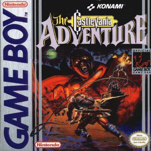
Let’s start this list off strong. The Castlevania series has always had great box art, but this one for Castlevania: The Adventure is at another level. The extreme camera angle, the Frazetta-esque, faux-Conan attire, the giant, daunting overlay of Dracula — everything about this box art screams late-’80s pulp horror movie poster, and I love it.
Metal Gear Solid
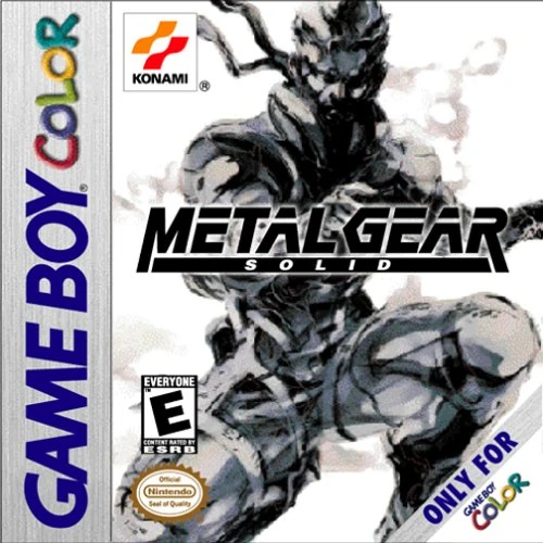
Hideo has put Yoji Shinkawa’s distinctive art on the cover of nearly every Metal Gear game since Solid, and can you blame him? The box art for the Game Boy Color port of Metal Gear Solid is simple and evocative, direct without becoming literal. You can’t make a bad cover when you’ve got a concept artist like Shinkawa on your team.
Metroid II: Return of Samus

If you were a Metroid fan in the ’90s and saw this box art on the shelf, there’s no way you weren’t begging your parents to buy it for you. Samus looks like a spacefaring RoboCop ready to bust Aliens in a time when both those movies were blowing up cinemas. Her armor is on full display in glorious detail,
Contra: The Alien Wars
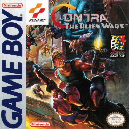
Have you ever seen a piece of box art that captures the tone of its game so perfectly? Contra: The Alien Wars is an excellent port of the SNES run-and-gun action-platformer and this cover art lets you know exactly what makes it so great: fast and frantic shooting action, hordes of alien invaders, and a bandana-rocking, muscle-bound protagonist. This is Rambo versus space bugs — what more could you ask for?
Akumajō Special: Boku Dracula-kun

Known as Kid Dracula in the US, Akumajō Special: Boku Dracula-kun is a quirky platformer that also happens to be a silly parody of Konami’s own Castlevania series. Of course, you didn’t need me to tell you that — the immaculate cover art lets you know it. Just like its game, this cover art draws you in with its undeniable cuteness.
Pokémon Red/Blue
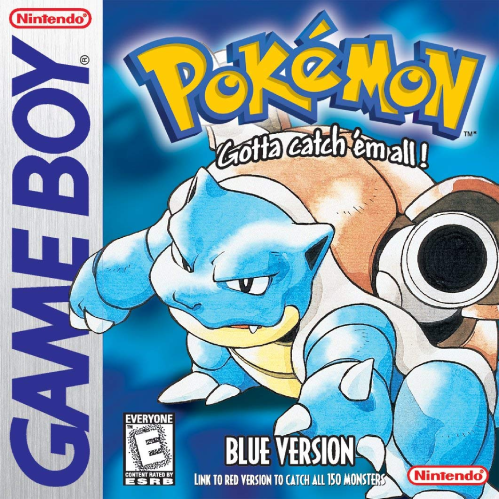
The American covers for Pokémon Red and Blue are important for two reasons. First, they introduced the world to the name Pokémon (the Japanese art uses the full Pocket Monsters moniker). Second, they gave us that instantly memorable slogan: “Gotta catch ’em all!”
This is the box art that launched the highest-grossing IP in modern history.
Megami Tensei Gaiden: Last Bible
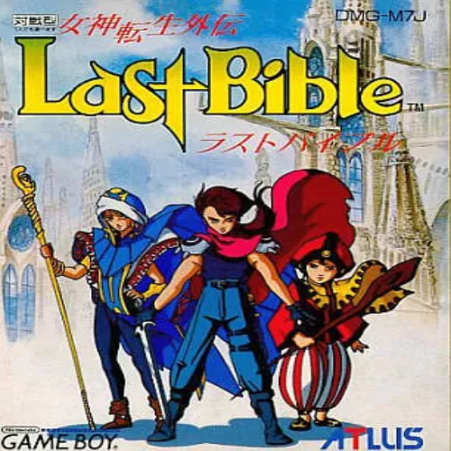
If you didn’t grow up in the ’90s, then this cover might not do much for you, but to me, there’s something so nostalgic about the flowing lines and bright colors of the anime from this era. Megami Tensei Gaiden: Last Bible is a middling JRPG at best, but if I had grown up in Japan, I would have bought this game in a heartbeat based on the cover art al
Rockman World 3
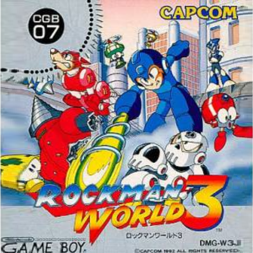
It’s always been a mystery to me why Capcom greenlit the boring 1994 TV series and not something more in line with their own designs for the Blue Bomber. In the ’90s, the Japanese cover art for the Mega Man series looked destined for Saturday morning cartoon success. Just look at it!
Tamagotchi
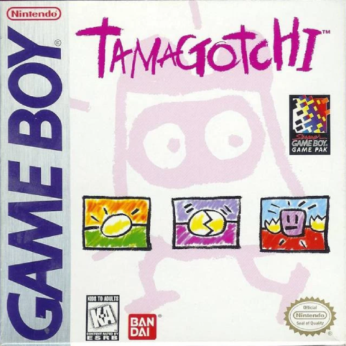
When you’ve got a name as big as Tamagotchi, what else do you need? The box art for the Tamagotchi game boy game only has to do one thing: convey a mood. The calming colors and simple graphics sell you on the game’s cozy, comforting mood.
It also helps that, at the time, Tamagotchi was massive. When your brand is that big, sometimes a name is all you need.
The Legend of Zelda: Link’s Awakening
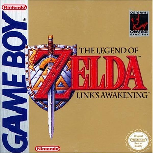
Video game box art isn’t about selling games; it’s about selling adventure and making you believe that those vibrating pixels are street fighters, armor-clad space explorers, or whip-wielding vampire hunters. They usually do this by showing you a detailed illustration of what those vibrating pixels represent.
The box art for The Legend of Zelda: Link’s Awakening doesn’t have to do that. You see the gold box and beautifully rendered shield and know you’re in for a high-fantasy romp. Who cares what the hero or big baddie look like? You’re sold.
