They say that beauty is only skin deep, but when it comes to the world of Game Boy Advance (GBA) game cover art, that surface-level appeal often serves as the first gateway to the gaming experience within. From vibrant illustrations to intriguing designs, the cover art of GBA games has the power to captivate and spark curiosity. These are seven of the best game cover boxart regardless of the quality of the games themselves.
Best game boy advance cover boxart
7. Super Duper Sumos

At first glance, the cover boxart of Super Duper Sumos might appear tasteless, but it actually manages to encapsulate the very essence of the animated series it represents. Depicting three sumo wrestlers engaging in a consciously comedic “moon landing” maneuver might come across as tacky, yet it undeniably delivers a hearty dose of hilarity. The utilization of the series’ distinctive art style further enhances the overall appeal of the cover art, establishing a direct connection with the source material.
Regrettably, the cover art and its association with the original series emerge as the sole redeeming features of this game. As an entry to a highly competitive beat-em-up crowd on the GBA, Super Duper Sumos fails to stand out as a remarkable contender or even earn a place in the category of “so bad it’s good.” However, regardless of the lackluster gameplay, the cover art remains poised to evoke genuine amusement, offering a chuckle-worthy experience that might just make somebody’s day.
6. Teen Titans
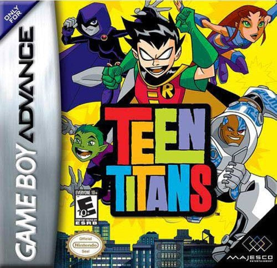
The cover boxart for Teen Titans on the PlayStation 2, GameCube, and Xbox stands out as a prime example of exceptional visual design within the realm of video games. However, even though the cover art for the GBA port takes a different direction, it manages to retain a surprising level of awe-inspiring appeal.
Teen Titans’ distinct yellow background serves to enhance the prominence of the darker hues that define the main cast. Complementing this contrast, the title font and its vibrant array of colors contribute to an overall visual composition that is both lively and captivating. While the gameplay experience itself might fall into the category of middling yet decent, the cover art is undeniably a standout element. Its captivating colors alone have the power to seize the attention of anyone who comes across it, making it a remarkable visual entry into the world of video game cover art.
5. It’s Mr. Pants
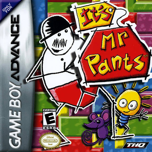
In a rare flop from Rare, puns fully intended, It’s Mr. Pants boasts a unique, clever, and visually engaging design. The utilization of vibrant colors, playful typography, and the central character himself—Mr. Pants—depicted in a comical, charismatic pose with charming and childlike shading, holds a captivating effect on the beholder.
The consistency of color and the distinct simplistic art style is as simple as its gameplay. While not necessarily a bad game, considering it’s a puzzle game from Rare, higher expectations were prevalent. Nonetheless, the cover art undeniably satisfies.
4. Castlevania: Harmony of Dissonance
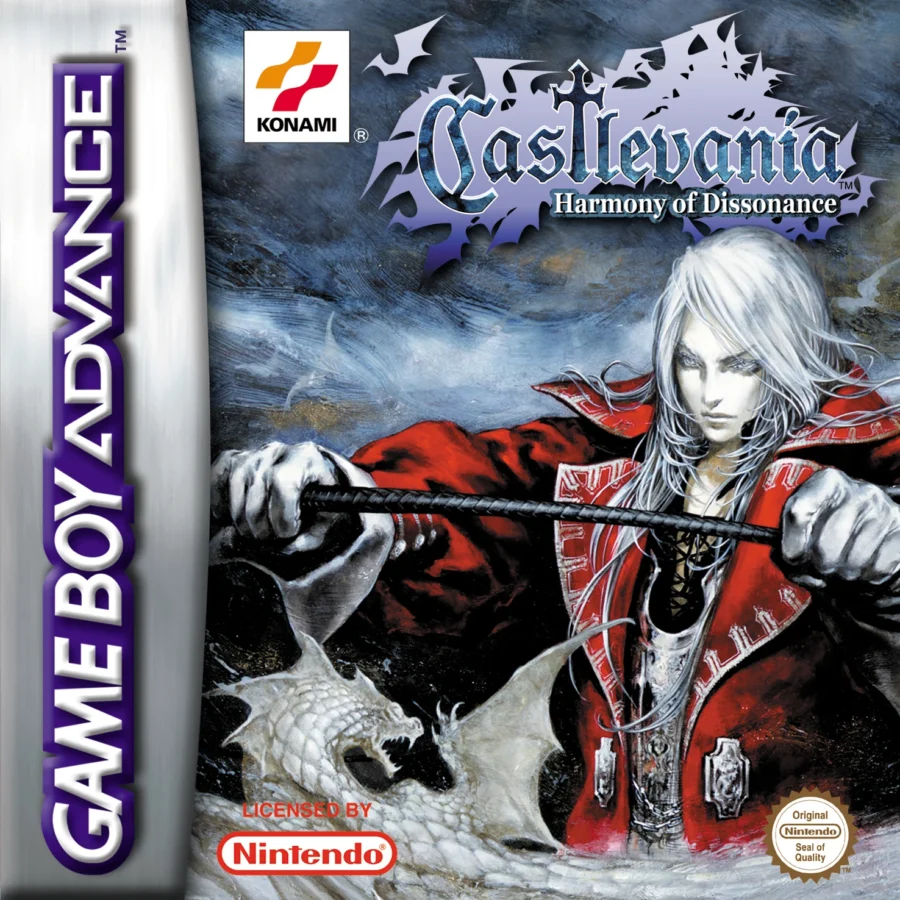
Castlevania: Harmony of Dissonance often finds itself overshadowed by Aria of Sorrow, with the latter undeniably being the superior game. However, when it comes to superficial aspects, Harmony of Dissonance’s cover art stands out, even against Aria of Sorrow. The striking visual of Juste Belmont’s pale complexion harmonizing with the vibrant red costume is truly a feast for the eyes.
In the gameplay department, Harmony of Dissonance introduced spell books that grant access to various spells. However, these books must be discovered before any spells can be cast. Another noteworthy aspect incorporated into the game is the experience system. Juste earns experience points every time he defeats an enemy, which eventually accumulates to level up, akin to RPG mechanics. This leveling up enhances Juste’s overall capabilities.
Both the cover boxart and the game’s art direction are incredible. This is such a rare feat that the cover is as good as the game in lists like these.
3. Tales of Phantasia
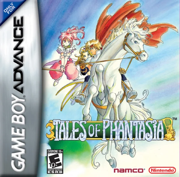
It’s intriguing how Namco opted for different covers for Tales of Phantasia depending on the console platform. While the PlayStation cover is undeniably impressive—so much so that even the iOS version utilizes it—the Nintendo version stands out for its captivating pastel color palette, deviating from the typical anime aesthetic of the PlayStation version.
Tales of Phantasia, as the pioneer of the Tales series, boasts a distinctive art style on Nintendo consoles that leans more towards a physical illustration rather than an animation-like appearance. This game marked the inception of the beloved Tales franchise. Amidst the series’ various highs and lows, the first game remains a perennial favorite. In a gaming landscape where turn-based gameplay largely prevailed for JRPGs during that era, the action-oriented approach of the Tales series eventually gained prominence that even modern Final Fantasy titles utilize the action-RPG mechanics.
2. Tony Hawk’s Underground
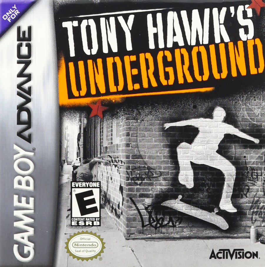
The cover art of Tony Hawk’s Underground encapsulates the essence of its generation, reflecting an era of skateboarding culture and extreme sports. However, it’s unfortunate that the GBA’s spine art detracts from this otherwise perfect cover. This artwork serves as a visual time capsule, capturing the spirit of the early 2000s when skateboarding and extreme sports gained massive popularity.
The cover’s vibrant and dynamic design resonates with the game’s energetic gameplay and rebellious attitude, making it an iconic representation of its time. The dark colors, although not a direct representation of skateboarding culture, effectively capture the essence of the underground scene with elements like the brick wall and spray paint. The cover’s simplicity speaks volumes, conveying the game’s essence without resorting to heavy-handed imagery. It’s a visual snapshot that perfectly encapsulates the era’s attitude and style.
1. Mario Pinball Land
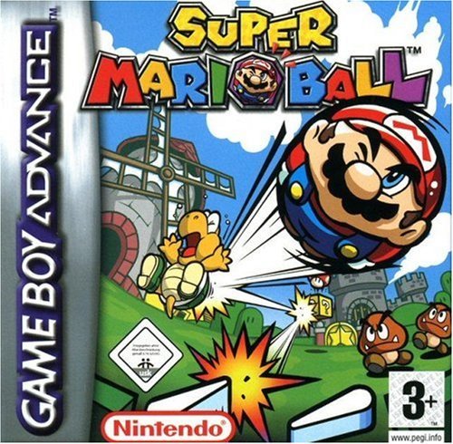
Mario Pinball Land’s cover art features the beloved plumber in his signature red cap and blue overalls, transformed into a pinball with flippers. The colorful and whimsical design hints at the game’s fusion of classic Mario elements with pinball gameplay. The dynamic artwork captures the essence of the game’s fast-paced and arcade-inspired mechanics, offering a playful and engaging visual representation of the unique gaming experience.
As a game, it’s pinball, and that is that. Mario Pinball Land was critically panned on its release because it is merely mediocre. There is no excuse for Nintendo for releasing such mediocrity when Pokémon pinball games are one of the best games out there, pinball or otherwise. The cover entices the players from then until now, but it only leads to disappointment.