The Game Boy, a portable gaming console that captured the hearts of millions in the late 1980s and early 1990s, holds a special place in gaming history. With its monochromatic display and simplistic graphics, the Game Boy pushed the boundaries of portable gaming and became an icon in its own right. However, despite its immense popularity and the wealth of incredible games it offered, the Game Boy also bore witness to some truly abysmal cover art. Here are seven of the worst box arts on the dedicated gaming handheld.
Worst game boy box arts ever
7. Street Fighter 2

Street Fighter 2, a game that has achieved iconic status and transcended boundaries, unfortunately, suffers from the disastrous box art on the Game Boy. Aside from the poor art style, the proportions are notably off, with Blanka’s head appearing disproportionately large (even in his monstrosity) compared to Chun-Li’s entire torso. Furthermore, the depiction of Ryu lying on the ground, beaten up, adds to the jumbled mess. The inclusion of a trash can in the background may unintentionally convey a subliminal message suggesting that indeed the game is trash.
The limitations of the Game Boy hardware are evident in the lackluster graphics and choppy animations, which diminished the impact of the iconic characters and their signature moves. It does not mean the cover should follow suit. It is still the best fighting game on the platform despite all of these.
6. Greet Greed

The stark contrast between the Japanese and American cover art for Great Greed on the Game Boy is evident. The former offers a 90’s style anime that is both appealing and tasteful especially given the spicy design of one of the enemies that was censored on the North American release. Meanwhile, the latter is just uninspired and not a representation of how great and innovative the core mechanics of this game is.
Great Greed stands out with its innovative real-time battle system, which introduces a refreshing departure from traditional menu-based combat mechanics. In this game, inaction has consequences as enemies will automatically attack when the player hesitates. The combat controls are uniquely assigned, with dodging assigned to the B button, attacking to the A button, and magic spells controlled by the directional pad, where each direction corresponds to a different spell. This dynamic and intuitive system requires players to remain fully engaged and agile to successfully navigate battles and ensure survival.
5. Ninja Taro
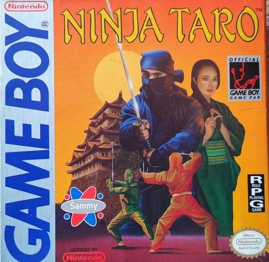
Localization teams have developed an unfortunate obsession with transforming anime-like covers into realistic-looking graphics, often resulting in a clash of conflicting art styles. Ninja Taro is a prime example of this dilemma.
The cover art for this game finds itself caught between two contrasting styles, where the depiction of a woman appears to have been edited to resemble a drawing, but ends up looking like an awkward fusion of realism and illustration. The color scheme further exacerbates the issue, with the vibrant orange ninja suit juxtaposed against a sunset orange-dominated backdrop.
Ninja Taro is an enjoyable action-adventure game enriched with RPG elements. Players take on the role of a skilled ninja tasked with aiding the righteous Lord Nobu in his quest to locate and defeat his formidable adversary, the wicked Lord Shin. This game never shot up the mainstream, and it is not because of the game’s quality, but because of the cover screaming “SKIP”.
4. Brain Drain

Brain Drain is one of the best puzzle games on the Game Boy. It would not look like the game is enticing due to its super bland box art. A clock is superimposed on drab shapes and the swirly black-and-yellow background does not even describe how the game plays.
This game is one of the recommended puzzle games despite the cover which is utterly uninspiring. The mechanics of this game involve a quasi-match-3 puzzler, but it is actually a memory game. Indeed, appearances can be incredibly deceiving, as this seemingly unremarkable game holds surprising depth and incredible core gameplay.
3. Hammerin’ Harry
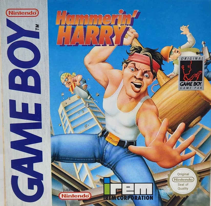
The Japanese box art of Hammerin’ Harry on the Game Boy is undeniably adorable. However, the North American and European covers, in contrast, are incredibly disappointing. Irem attempted to transform the cartoony charm of the character into a menacing figure wielding a hammer and wearing a wifebeater. They even replaced Harry’s traditional hachimaki with a red bandana. This misguided attempt to make the character appear more “realistic” and macho is not only abhorrent but also unfitting.
This is an enjoyable action side scroller where enemies appear from the sides or behind objects. The boss battles are entertaining, although slightly easy. The main drawback is the game’s length (or lack thereof), with only 5 levels and 4 bonus stages, leaving a desire for more content.
2. Double Dragon

Tradewest’s ill-advised endeavor to Americanize the box art of the classic beat-em-up game resulted in a truly abhorrent game cover. Double Dragon on the Game Boy is a timeless classic that embodies the essence of the beat-em-up genre. It successfully captures the thrilling action and intense combat of its arcade predecessor. And the cover art is everything but the representation of the great quality of the game.
The cover art of Double Dragon on the Game Boy unfortunately does a disservice to the beloved characters, Billy and Jimmy Lee. The attempt to adapt them into a Western cartoon art style falls flat, resulting in a totally ugly rendition.
Moreover, the cover’s odd cropping, where the illustration does not fully cover the front, but instead leaves a significant green space. While the Western cartoon art style itself is not inherently bad, its execution on this particular cover fails to do justice to the iconic characters and detracts from the game’s G.O.A.T. tier status.
1. Pinball Fantasies
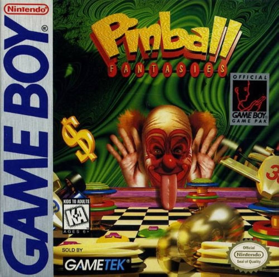
In the 90s, clowns like Pennywise from Stephen King’s “It”, at the time a popular mini-series, and Doink the Clown from the World Wrestling Federation (now WWE) managed to strike fear into the hearts of children, leaving a lasting impact on their innocent minds. Pennywise, with his menacing grin and shape-shifting abilities, exploited deep-seated fears and capitalized on the vulnerability of children. Doink the Clown, on the other hand, blurred the line between humor and horror, combining his colorful appearance with unpredictable and sometimes sadistic behavior. Both these iconic figures tapped into primal fears, creating a wave of clown-induced trauma that haunted countless children during that era, leaving a lingering unease even long after the circus had left town.
It is truly puzzling why developer Spidersoft or publisher GameTek chose to feature a menacing clown with an unnaturally long tongue as the box art for a pinball game. Pinball Fantasies stood out as one of the superior pinball games of its time, surpassing even digital pinball games on home consoles. The trauma inflicted by the disturbing image is so intense that gamers might not even glance at the cover, let alone consider purchasing it.