They say not to judge a book by its cover, but video games clearly aren’t books, because back before the internet, a lot of video games were bought on the quality of their box art alone. Knowing how important box art is for marketing a game, publishers put a lot of resources into making them appealing to a young market.
Well, most publishers did, anyway. There’s a lot of bad video game box art out there, and the Game Boy had its fair share of misses. I know because I looked at over 1,000 Game Boy games to find the 10 worst Game Boy box arts (thanks shawnshyguy on GitHub for making their collection publicly available).
So, join me on a journey into the cringe-worthy world of bad Game Boy box art. From bizarre and confusing to just plain ugly, these box art designs are a cautionary tale in how not to promote a video game.
Kung’Fu Master

It’s a good thing this 1990 action-adventure has such a literal name, because nothing about a man riding a camel in front of the double pyramids of Egypt signals “practitioner of ancient martial art”.
Props to the copywriter who tried to make all of these conflicting ideas work, even going all in with the Arabic glottal stop in “Kung`Fu” (nice touch!). Oh, and the hero moonlights as a camel racer, hence the camel (there are zero camels in the game).
If you thought all of that was strange, this game is actually a sequel to the video game tie-in for a Jackie Chan movie about delivering food to people in need. Ancient Egypt and meals on wheels — I guess kung fu can be pretty versatile!
Zoop
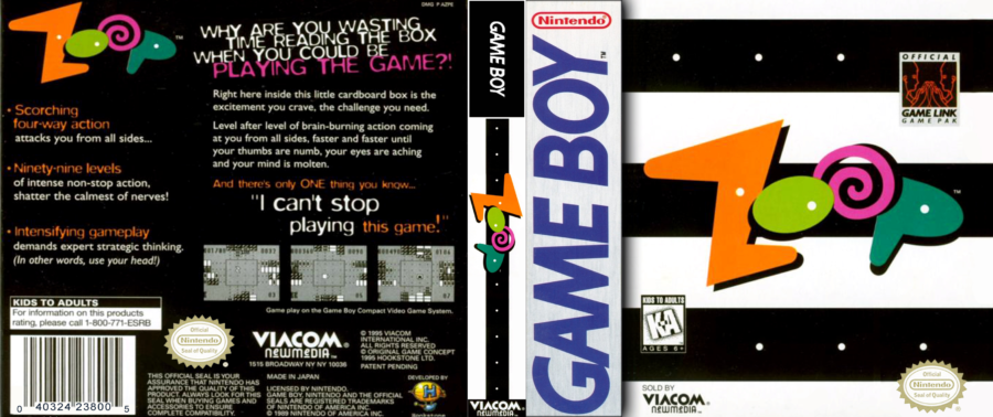
“What is a Zoop?” you ask. Looking at this logo and cover art, I don’t think even their graphic designer knows.
Nothing about the word “zoop” or this box art conveys “scorching four-way action”. Zoop sounds like a Gak knockoff or the last thing you hear before being thrown into the trunk of a clown car.
The back of the box even rips on you for trying to learn more about the game. How dare you want to know what you’re spending your forty 1995 dollars on (that’s $80 today!).
If someone gifted me this game back in the day, I’d zoop my way to Funcoland for a trade-in.
Wheel of Fortune
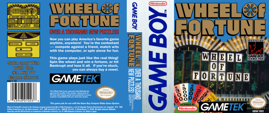
Is there an echo in here? The box art for Wheel of Fortune (Wheel of Fortune) makes this list for its pointless excess. Remember: this was peak game show era; the designer could have taken that shot of the game board, slapped the official Nintendo graphics on top, then called it a day.
In my head canon, the designer just really loves Wheel of Fortune and knew that, according to the game’s rules, vowels cost $250 a pop. Putting the game’s name on the art twice means you get 12 vowels for the price of one box art. That’s just being fiscally responsible.
More likely, some bean counter made the executive decision to throw the official logo on there, just to be doubly sure players knew this was associated with the Wheel of Fortune™. In all honesty, of the things something called Wheel of Fortune could be about, a word-guessing game hosted by Pat Sajak is the last thing I’d want.
The Game of Harmony
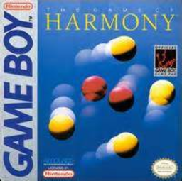
There’s something unnerving about this picture of violently vibrating balls. That’s probably not a good thing if you’re going to call your product “The Game of Harmony”.
To be fair, of all the box art on this list, this one is probably the most representative of the actual gameplay. Just watch a few seconds of a longplay on YouTube, and tell me that’s not exactly what you pictured going in.
That right there is pure, uncut kid repellant.
Teenage Mutant Ninja Turtles:
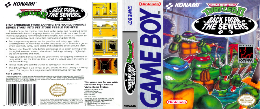
I know the world’s most fearsome fighting team are supposed to be grimacing menacingly, but their awkward poses make it look like they’ve been forced to swap roles for a day and are angry and confused about what to do with their new weapons.
Michelangelo clearly drew the short stick. His bandana is the wrong color, they slapped the Game Boy Game Pak graphic right on top of him, and he isn’t even facing the right way.
Now, it could be that the box artist just hates party dudes. Or maybe my theory was right, and that’s actually Leonardo in a half-hearted Michelangelo cosplay seriously contemplating marching the crew right back into those sewers for good.
Rescue of Princess Blobette

The box art for David Crane’s the Rescue of Princess Blobette Starring A Boy and His Blob (say that 10 times really fast) takes everything that was charming about the first game’s cover design and tosses it into a Scottish bog.
Who in their right mind thought this shot of a random castle would appeal to children? This series went from eye-catching hand-drawn comic book art to a grim stock photo. A Boy and His Blob was decently well-known brand at the time, and they threw the eponymous duo in at the bottom as an afterthought.
I hope the designer is ashamed of themselves.
Heavyweight Championship Boxing
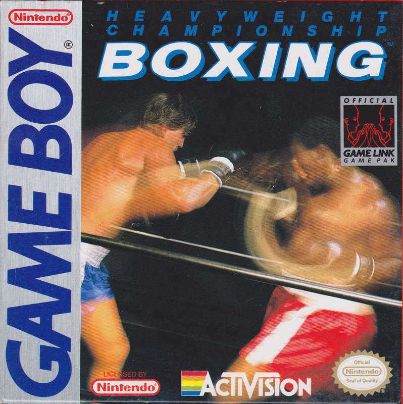
Did every box artist in the nineties discover the blur effect in Photoshop at the exact same time? There’s a lot of games I could’ve pointed at as examples for why I hate egregious blur on box art, but Heavweight Championship Boxing is the worst case, by far.
They were trying to capture the pure pace of pugilism but instead gave us this snap of some guy button mashing in real life. By the looks of it, all of those shots are whiffing, too, because every strand of his opponent’s carefully constructed undercut is immaculate.
Mega Man Dr. Wily’s Revenge
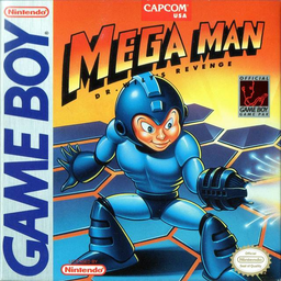
Poor Mega Man. Between this and the US version of his debut game, the Blue Bomber has two of the worst box arts in video games.
The first thing you regret seeing is whatever is going on with his chest. Are those abs or are his ribs engorged? He’s a robot; he doesn’t need bones or muscles.
And then you see those cold, remorseless eyes and that creepy smile. Mega Man, you’re literally dismembering your own kind — try not to look like you’re having fun.
Mankind should be thanking Dr. Wily for giving this heartless machine a purpose. I don’t want to know what happens when Mega Man runs out of Robot Masters to obliterate.
Mr. Nutz
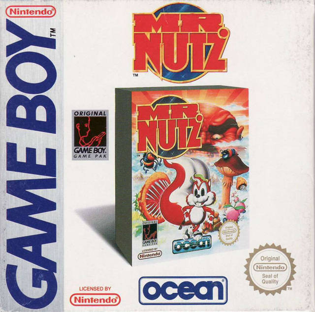
I gave Wheel of Fortune flak for writing the game’s name two times on the box art, but Mr. Nutz takes it to a whole other level — it’s a box on a box.
Did the designer just forget that the front of the box is already, you know, the front of the box? It’s not even a shot of a different version of the game, because the “Original Game Boy Game Pak” graphic is right there along with the Nintendo Seal of Quality.
Everything about this defies logic. You can’t even chalk this up to a lazy artist, because they literally had to put in twice the work to make it this bad.
FIFA Soccer 96
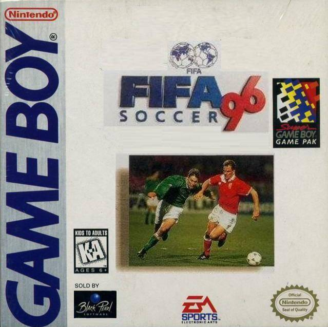
Credits to Guard_Master and devilsteo88 from the GameFAQs forums
In 2020, EA Sports unveiled this ridiculous box art for the 2021 edition of their money-printing franchise and was immediately met with vitriol and gratuitous bullying. Looking at the cover for FIFA Soccer 96, I find myself wondering: was that lazy copy-paste job a conscious throwback to the FIFAs of old? If so, then they deserve double the slamming because this box art is terrible.
They took a great photo of the Netherlands legend Frank de Boer fending off an Irish striker and surrounded it with as many non-soccer logos as they could find. A lot of short-sighted kids probably missed out on a really good portable FIFA game.