Game publishers held a significant advantage when the Game Boy Color arrived, as they had a clear understanding of what sells well, not just in terms of game design but also in box art. However, despite this knowledge, some publishers seemed to have missed the mark when it came to creating compelling cover designs. Take a closer look at seven of the worst box arts to (dis)grace the portable handheld gaming device.
Worst game boy color box arts
7. Alfred’s Adventure
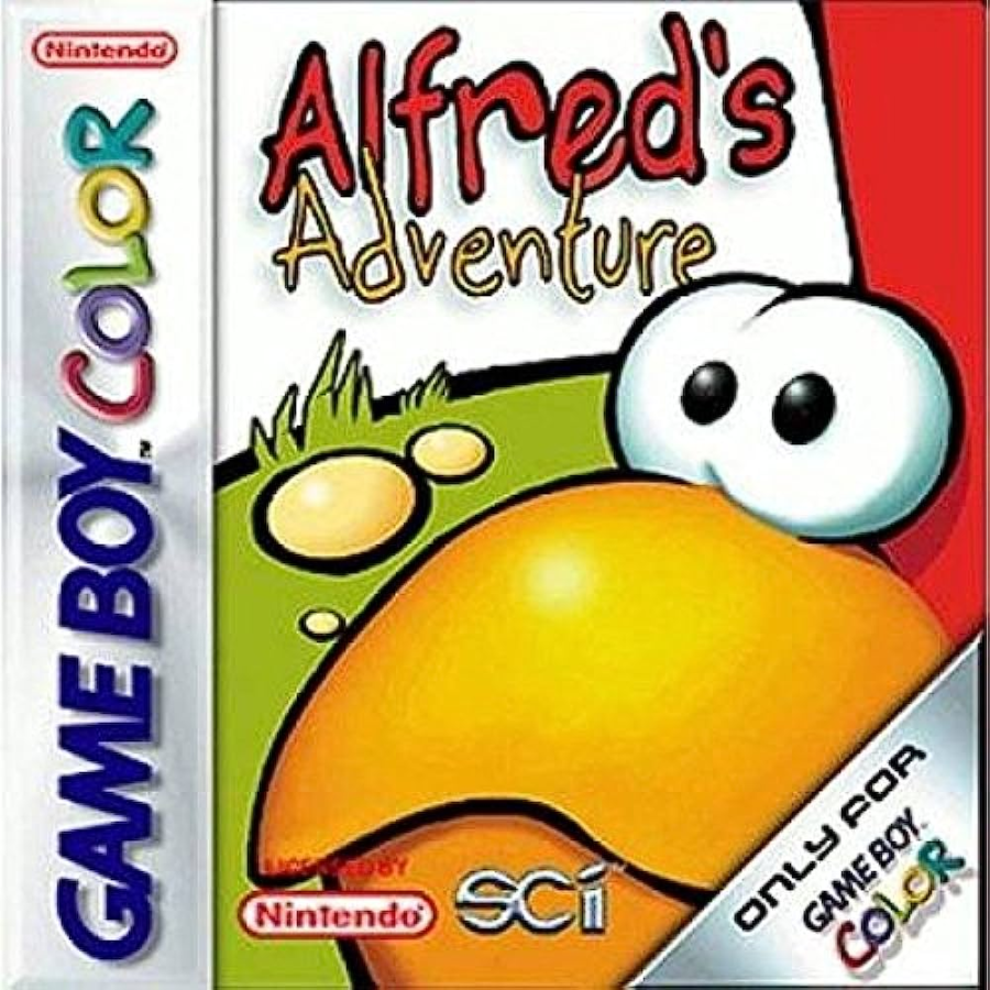
Alfred’s Adventure is a competent platformer with a decent art style. However, an odd design choice in the box art raises eyebrows. The artwork zooms in on the chicken’s face, featuring only the protagonist’s beak and eyes. Unfortunately, this close-up reveals a somewhat comical and lifeless expression on Alfred’s face, which doesn’t do justice to the feathered hero.
The cover design might be off-putting to potential buyers, giving the impression that it belongs to the category of over-simplistic, Saturday morning cartoon licensed games aimed at very young children. While it may not reach the iconic status of Super Mario, it certainly exceeds the low expectations set by the cover, which truthfully is, a low bar to clear.
6. Vigilante 8
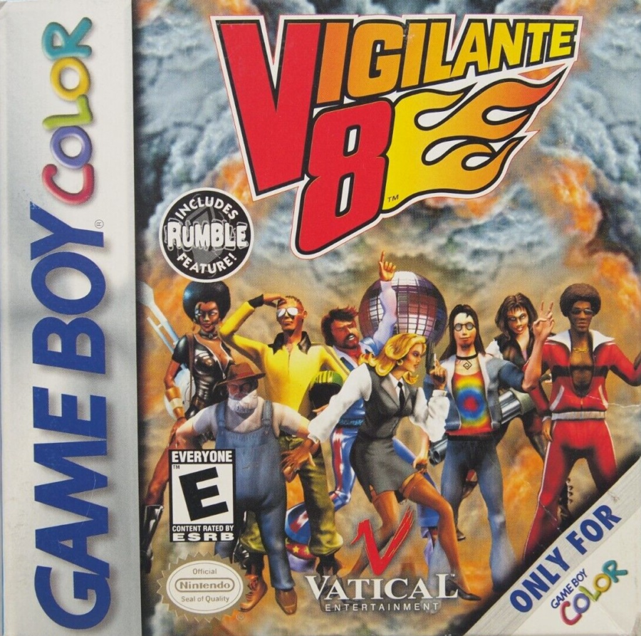
Vigilante 8 diverges from Twisted Metal’s grungy death metal art style, offering instead a retro-futuristic, alternative history setting for its thrilling vehicular mayhem. While Twisted Metal may enjoy greater popularity, Vigilante 8 proves itself as a formidable contender. The Game Boy Color port, however, is a terrible game even surpassing its disappointing game cover.
Vigilante 8 on the original PlayStation has the iconic cover of a school bus with guns a-blazing. However, the Game Boy Color version takes a questionable artistic approach with its cover art, showcasing the driver characters, instead of the vehicles, striking poses around a disco ball at the center. While the intention may have been to evoke a disco-era vibe, the execution falls short, resulting in what appears to be a mishmash of elements with poor art direction. The characters themselves seem disjointed and inconsistent as if they were copy-pasted from various sources with different art styles. Some even have higher quality than others in terms of resolution and colors. To add to the confusion, the gray smoke background only adds to the mixed signals.
5. Toki Tori
Toki Tori for Game Boy Color is a delightful and charming puzzle-platformer that packs a surprising amount of brain-teasing challenges into its compact cartridge. The game’s clever use of limited resources and tools adds depth to the gameplay, requiring players to strategize and plan their moves carefully. It is one of the best puzzlers on the Game Boy Color.
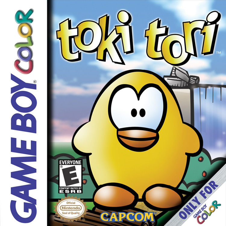
Yet the game’s box art gives off a dated and amateurish vibe reminiscent of mid-2000s Flash-based browser games. While Flash-based browser games are not inherently bad even those made by hobbyists, the box art’s overly zoomed-in and solidly colored depiction of the protagonist feels unappealing and reminiscent of cheap junk food packaging.
4. Blaster Master: Enemy Below
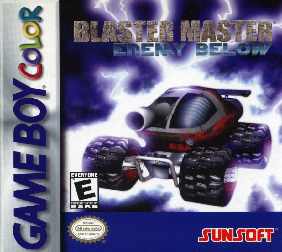
The Japanese cover of Blaster Master truly reflects the essence of this underrated and underappreciated game, serving as a testament to its quality. However, the US cover is a stark contrast, giving off a rather amateurish vibe. The design appears as if it were hastily put together using Microsoft Word’s Word Art feature, with a jumble of textured concrete and gradient effects that lack coherence.
The font choices add to the overall unappealing look, being incompatible and unattractive from the outset. The background’s blue lighting-ish effect further compounds the issue, obscuring the vehicle and creating a confusing visual mishmash. It seems like a collection of wrong decisions all made simultaneously, resulting in a cover that does not do justice to the game’s true worth.
3. Centipede
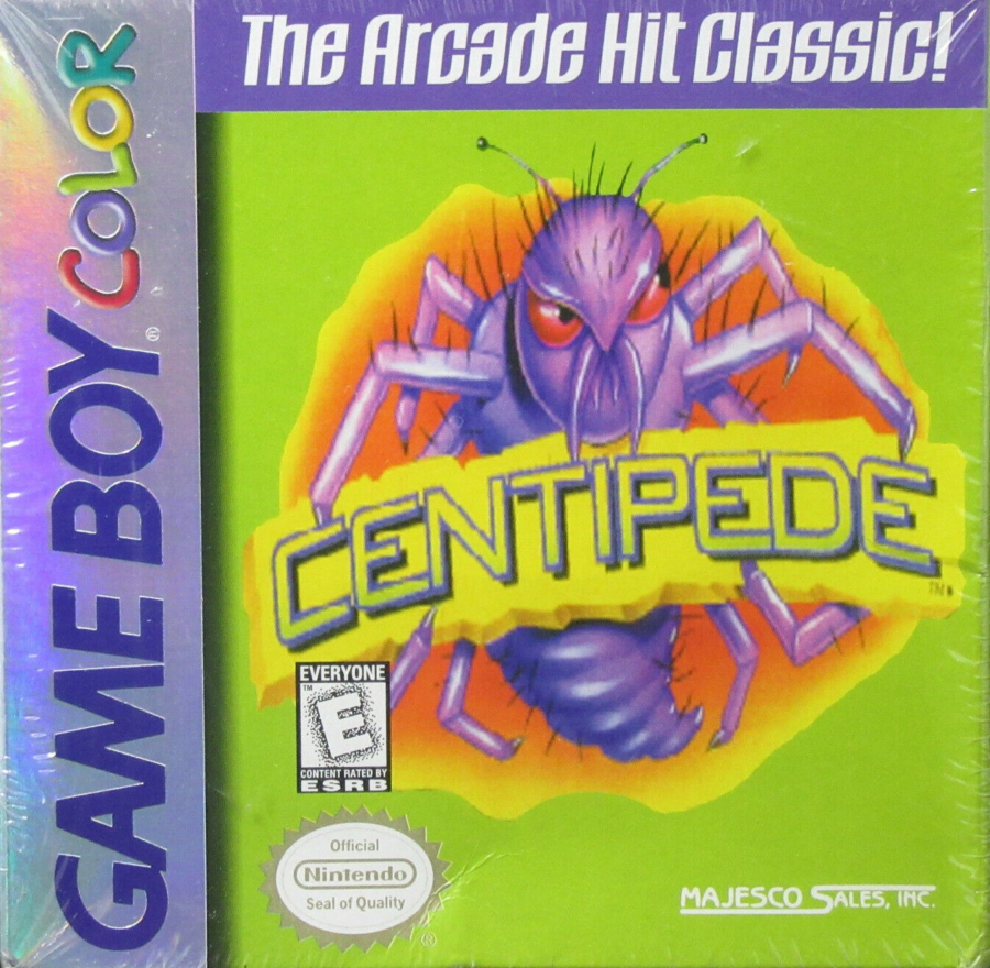
Centipede is a classic arcade game that delivers simple yet addictive gameplay. Players must skillfully maneuver their shooter to eliminate a descending centipede while avoiding various other bugs. It’s retro charm and challenging mechanics make it a timeless and enjoyable experience for arcade enthusiasts.
While purchasing this game, most people would likely overlook the cover art, as Centipede was a well-known title during that time. However, upon retrospection, it becomes evident that the cover art is quite offensive to the senses. It suffers from being overly simplistic and unappealing, a rare combination indeed. In stark contrast, the original Game Boy version of the same game stands out as one of the best-looking covers of all time. Perhaps this stark difference is why the Game Boy Color cover is scoffed at, especially when everyone knows it could have been so much better.
2. E.T.: The Extra-Terrestrial and the Cosmic Garden
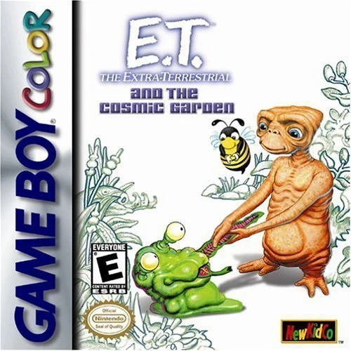
E.T. has already faced its fair share of controversies due to being associated with the infamous video game crash. However, it’s essential to note that the version released on the Game Boy Color predates its notoriety as the supposed industry killer. Unlike the ill-fated Atari 2600 version, the Game Boy Color rendition offers a different gaming experience that was introduced prior to the game’s tarnished reputation. It’s a far better game, notwithstanding its horrible art direction where the alien’s skin is the same color as the ground making it hard to navigate.
The box art, however, fails to be enticing and only reinforces the notion that E.T.’s back for more disappointment. It appears as if the artist left the cover incomplete, giving it an unfinished look with plants sans color and the canvass being blindingly white. The alien itself looks repulsive as he pulls the tentacle of another equally hideous alien. Although a cute bee hovers around, it cannot carry the weight of redeeming whatever this is.
1. Ultimate Paintball
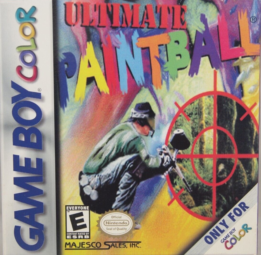
Paintball is just one of those physical activities that do not make sense to be digitalized. It is already a reduction of gun-shooting into an acceptable form. However, a paintball game appeared on the Game Boy Color and it probably should not just because of the gameplay, but also, because the cover art is truly horrendous.
The artwork in question presents a concerning image of a person that appears to be defecating. The background, executed in a smudgy multicolored pastel graffiti style, is unappealing and lacks visual coherence, making it challenging to discern the letters of “PAINTBALL” due to their blending with the background color. Interestingly, the inclusion of a gun scope with a view of vegetation, although fitting for the context of the game, stands out as a stylistic departure. The creators of the box art should have used such direction instead of this weirdness.
